- C
- G
A City Sleeps
VISUAL DESIGN
PROCESS + JOURNEY
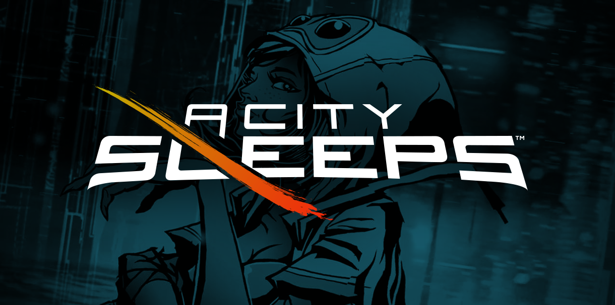
Harmonix had a small team working on A City Sleeps, a musically-driven shoot’em up in need of branding and visual design support. The design brief called for a treatment that could bridge the gap between typical shmup genre signifiers and the game’s unique narrative tilt. In most bullet-hell games, the player pilots an air or space craft, but in A City Sleeps, the player controls Poe, a dream exorcist who enters the nightmares of the citizens of SanLo City to help free them of a force that controls the city.
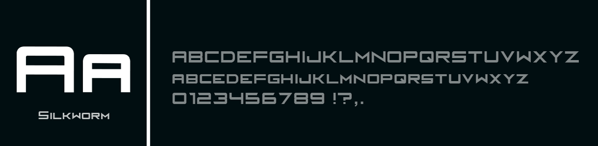
Working with the marketing manager and art director, we opted to juxatpose a soft-tech vibe with hand-drawn elements in hopes of capturing the spirit of the game and attracting prospective players. Leveraging the letterforms from the logo, a custom typeface Silkworm was created for an additional level of cohesion between the game's menu, HUD, and marketing materials.
LOGO DESIGN
MOOD BOARD
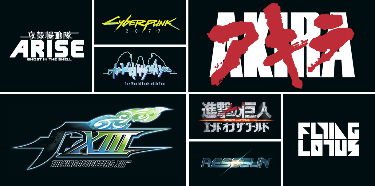
ROUGH IDEAS
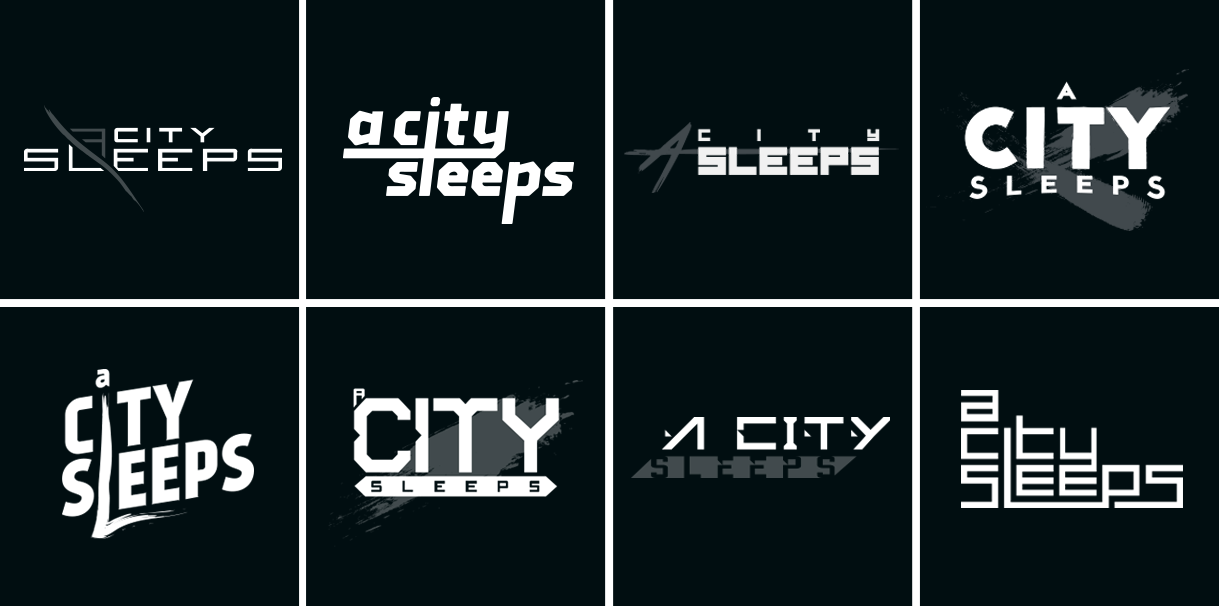
RENDER TESTS
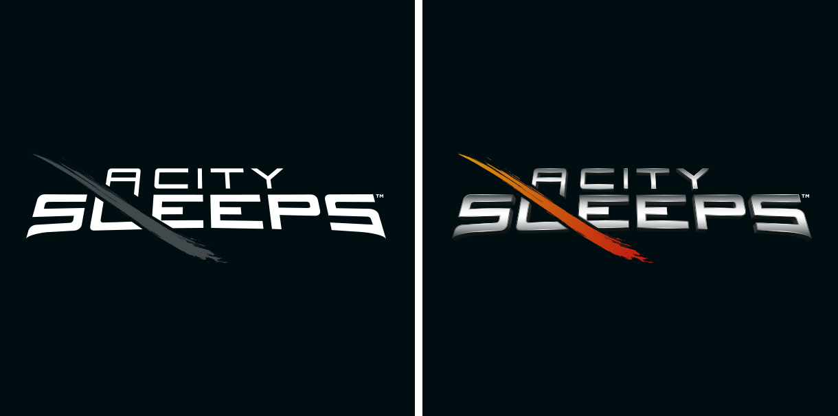
FINAL LOGO
"A City Sleeps is a tight, polished experience, that's at times overwhelmingly beautiful." - PC World
TYPOGRAPHY
PRIMARY
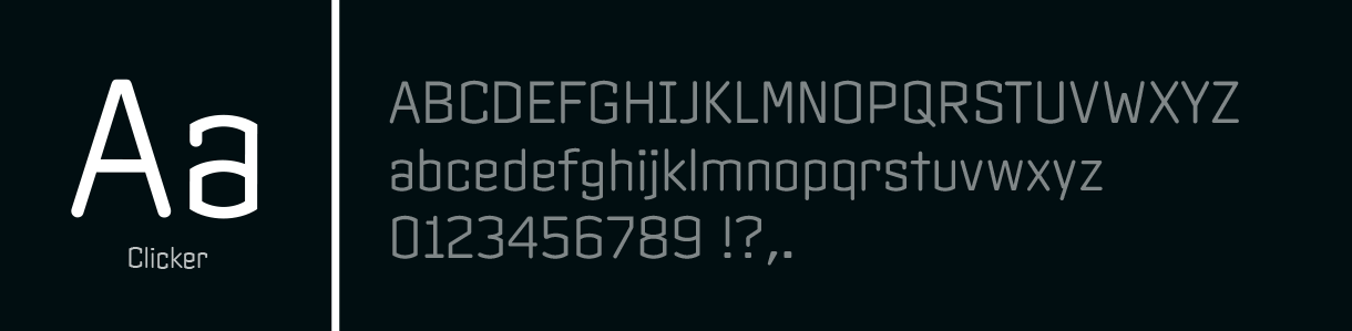
SECONDARY
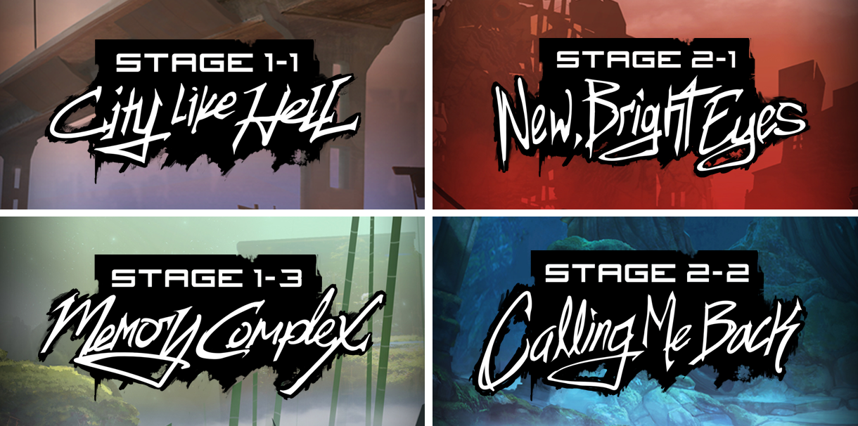
HANDLETTERED TITLE CARDS
"The stylized artwork is striking, and its pounding beats will burrow into your brain." - Engadget
- Art Direction + Character Illustrations: Matthew Perlot
- Environment Illustration: Lauren St. Onge
- Clicker Font: Font Bureau
CREDITS + RESOURCES
PLATFORMS


|
PREVIOUS PROJECT Hob |
NEXT PROJECT Rock Band Blitz |


